Brand Image
Add Ink Tattoo
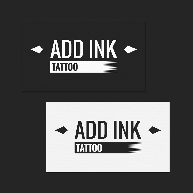
Add Ink Tattoo first tasked Jim with the creation of their logo. The goal was to design a powerful and timeless brand image.
Integration of Iconography
To make the brand stand out, I stepped away from the visuals typically associated with tattoo studios. I instead integrated subtle symbols related to the tattoo industry. Seen on each side of the logo are diamonds that, when pivoted at a 90° angle, represent ink drops and the background behind the word "tattoo" is a tattoo needle. The subtle integration of the symbols don’t overpower the logo.
A bold typography was chosen to reinforce the brand image in an expanding industry. For the owner’s taste, we opted for black and white tones that offer versatility.
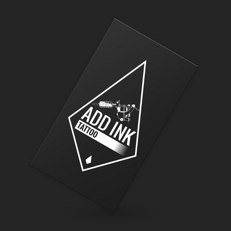
Alternative Logo
Add Ink Tattoo’s owner, Ève, assigned me with the job of creating a logo adapted for banners. While being more detailed, the new vertical logo is consistent with the original design’s look. Adding more details to this version of the logo was not a problem since its only purpose was to be a large physical banner.
Creation of the Illustration for the New Piercing Services
When the studio began offering piercing services, they asked me to create an illustration to represent their new services. The illustration keeps the diamond shaped ink drop concept with the addition of symbols representing the piercing industry. We can now see body piercing jewelry and two tattoo needles in the negative space, as well as a skull inspired by the well-known pirate flag.