Brand Image
Les entreprises Viking
The founders of the company approached me to design the visual identity of their new company. A multifaceted company, Les entreprises Viking operates in several different sectors, so it was necessary to have a versatile brand image.
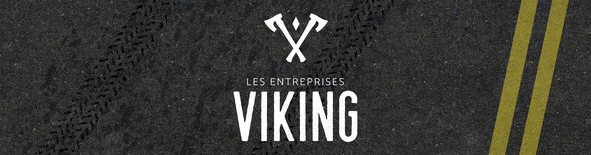
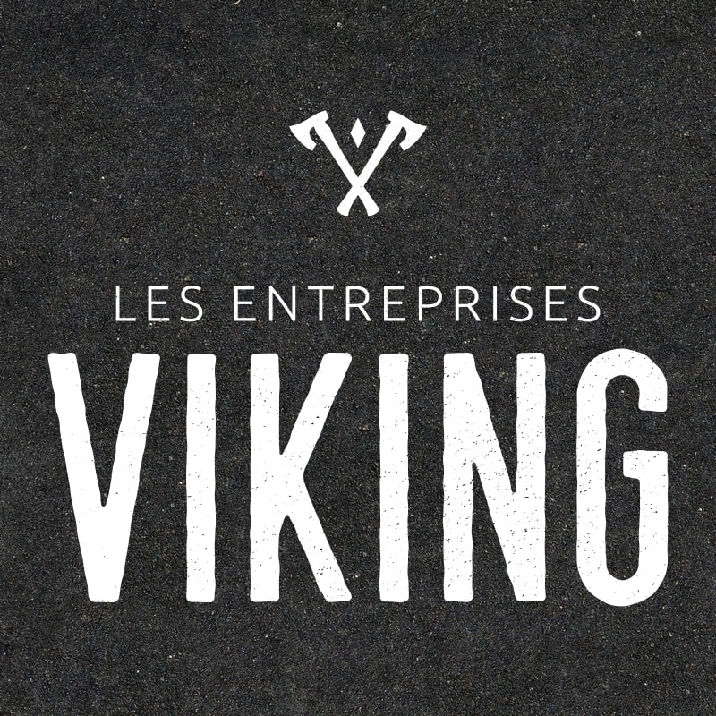
A strong and raw logo
Since the company's business sectors are physical and representative of hard work, a raw and robust appearance texture was required. The logo also refers to Nordic culture by displaying viking axes arranged in a v-shape. All of this is then accompanied by a fully personalized typography.
The two parts (symbol and text) can be used independently if required. This also opens up the opportunity to replace only the symbol if the company decides to make a particular sector of its activities grows by referring to it in their logo for promotion.